
Introduction to Alabaster Color
Alabaster color is a soft, warm white with subtle undertones of beige or ivory, evoking a sense of purity and sophistication. Named after the smooth, translucent alabaster stone, this hue has been cherished for centuries in art, architecture, and design. Unlike stark whites, alabaster color offers a gentle, inviting aesthetic that complements various styles—from modern minimalism to classic elegance.
In this article, we’ll explore the origins, applications, and psychological impact of alabaster color, along with tips on how to incorporate it into your home, fashion, and design projects.
The History and Significance of Alabaster Color
The term “alabaster” originally referred to a fine-grained gypsum or calcite mineral used in ancient sculptures and decorative arts. Due to its smooth texture and luminous quality, alabaster became synonymous with luxury and refinement. Over time, the word evolved to describe a color that mimics the stone’s delicate, creamy-white appearance.
Artists like Michelangelo and Donatello used alabaster for intricate carvings, while Renaissance painters incorporated alabaster color into their works to depict ethereal beauty. Today, this timeless shade remains a favorite in interior design, fashion, and branding for its versatility and calming effect.
Why Alabaster Color is a Design Favorite
1. Neutral Yet Warm
Unlike cooler whites, alabaster color carries a soft warmth that makes spaces feel cozy rather than sterile. It pairs beautifully with natural wood tones, metallic accents, and bold colors, offering a balanced backdrop for any design scheme.
2. Enhances Natural Light
Thanks to its slightly creamy undertones, alabaster reflects light gently, brightening rooms without overwhelming them. This makes it ideal for north-facing spaces that need a touch of warmth.
3. Timeless Appeal
Trends come and go, but alabaster remains a classic. Whether in modern farmhouse kitchens or contemporary office spaces, it provides an enduring elegance that never feels outdated.
How to Use Alabaster Color in Interior Design
Alabaster Color for Walls
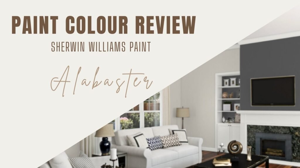
Painting walls in alabaster creates a serene and airy atmosphere. It works well in living rooms, bedrooms, and hallways, offering a clean yet inviting look. For added depth, pair it with darker trims or textured fabrics.
Alabaster Color in Furniture and Decor
From sofas to cabinetry, alabaster-colored furniture adds sophistication without dominating a space. Consider an alabaster-colored bookshelf or coffee table to maintain a light, cohesive aesthetic.
Accent Pieces in Alabaster Color
If you prefer a pop of contrast, use alabaster-colored vases, lamps, or throw pillows against darker backgrounds. This creates visual interest while keeping the overall look harmonious.
Alabaster Color in Fashion and Beauty
Beyond interiors, alabaster has made its mark in fashion and cosmetics. Its soft, flattering tone complements all skin types, making it a popular choice for wedding dresses, luxury handbags, and minimalist footwear.
Wardrobe Staples in Alabaster Color
An alabaster-colored trench coat or knit sweater exudes understated elegance. This shade pairs effortlessly with neutrals like taupe and charcoal, as well as bold hues like emerald green or navy blue.
Makeup and Nail Trends
In beauty, alabaster is often used in foundations for fair skin tones. Nail polish in this shade offers a chic, clean look suitable for both casual and formal occasions.
The Psychology of Alabaster Color
Colors influence emotions, and alabaster is no exception. Its soft white tone promotes:
- Calmness: Reduces visual stress, making it perfect for bedrooms and meditation spaces.
- Purity and Clarity: Often associated with new beginnings and simplicity.
- Sophistication: Conveys luxury without being ostentatious.
For these reasons, spas, wellness centers, and high-end brands frequently incorporate alabaster into their aesthetics.
Alabaster Color vs. Other White Shades
How does alabaster color compare to other popular whites?
| Shade | Undertones | Best For |
|---|---|---|
| Alabaster | Warm (beige/ivory) | Cozy, inviting spaces |
| Pure White | Cool (blue/gray) | Modern, crisp interiors |
| Cream | Yellow | Vintage, rustic designs |
| Ivory | Soft warmth | Elegant, traditional decor |
Alabaster strikes the perfect balance between warmth and neutrality, making it more versatile than cooler whites.
Tips for Pairing Alabaster Color with Other Hues
To maximize its potential, consider these combinations:
- Alabaster + Navy Blue: A timeless, high-contrast duo.
- Alabaster + Blush Pink: Soft and romantic.
- Alabaster + Black: Bold and modern.
- Alabaster + Olive Green: Earthy and refined.
Experiment with textures like linen, marble, or brushed metal to enhance the richness of alabaster .
Conclusion: Embrace the Beauty of Alabaster Color
Alabaster color is more than just a shade—it’s a design philosophy. Its ability to blend warmth with neutrality makes it a go-to choice for interiors, fashion, and beyond. Whether you’re refreshing your home or updating your wardrobe, this timeless hue offers endless possibilities.
By understanding its history, applications, and psychological effects, you can harness the power of alabaster to create spaces that feel both elegant and inviting. So why not introduce this exquisite shade into your next project?
Final Thoughts
From ancient sculptures to modern-day decor, alabaster has stood the test of time. Its subtle warmth, versatility, and calming presence make it a favorite among designers and homeowners alike. Whether you’re painting a room, choosing an outfit, or selecting decor, alabaster is a fail-safe option that never goes out of style.